View/Export Results
Manage Existing Surveys
Create/Copy Multiple Surveys
Collaborate with Team Members
Sign inSign in with Facebook
Sign inSign in with Google

Website feedback survey you can send today

Fourteen questions about the trip a visitor just took through your site: what they came for, whether they got it, and what nearly stopped them. It is a survey behind a link, so you choose where the link goes. Take it below, then lift the questions or open the set in the editor.

  • 14questions
  • About 3 minto complete
  • One linkyou place yourself
  • No scorea ranked fix list
Website Feedback Survey · answer to move through it
Use this template
Question 1 of 14 The visit
What did you come to this site to do today?
Find a specific piece of information
Compare prices, plans or options
Buy something or sign up
Get help with something I already have
Contact a person
Just looking around
Question 2 of 14 The visit
Did you get it done?
Yes
Partly
No
Question 3 of 14 The visit
If something got in the way, what was it?
I could not find what I needed
What I found did not answer my question
Something on the page did not work
It asked more of me than I wanted to give
It was taking too long
Nothing got in the way
Question 4 of 14 In your words
In your own words, what would you change about this site?
Question 5 of 14 Finding your way
The information I needed was easy to find.
1
2
3
4
5
Strongly disagreeStrongly agree
Question 6 of 14 Finding your way
It was clear where to go next on each page I opened.
1
2
3
4
5
Strongly disagreeStrongly agree
Question 7 of 14 Finding your way
The wording on this site made sense to me.
1
2
3
4
5
Strongly disagreeStrongly agree
Question 8 of 14 Speed and trust
The pages loaded fast enough for what I was doing.
1
2
3
4
5
Strongly disagreeStrongly agree
Question 9 of 14 Speed and trust
I felt I could trust this site.
1
2
3
4
5
Strongly disagreeStrongly agree
Question 10 of 14 What to fix
Did anything on this site fail to work while you were here?
Yes
No
I am not sure
Question 11 of 14 What to fix
Which one change would help you most on your next visit?
Clearer wording on the pages
A simpler way to move around the site
Faster pages
A search that finds things
More detail about prices or plans
More proof of who is behind the site
Something else
Question 12 of 14 Context and close
What are you using to look at this site right now?
A phone
A tablet
A laptop or desktop computer
Something else
Question 13 of 14 Context and close
Is this your first visit to this site?
Yes, my first time
I have been here before
I use it regularly
Question 14 of 14 Context and close
Overall, how was this visit?
1
2
3
4
5
PoorVery good

What a link-based survey catches, and what it cannot

This survey lives at its own link. Before the questions, the honest version of what that reaches, because it is not the widget that appears while somebody is browsing.

You place the link. The survey never places itself. It can sit in the footer of every page, on the confirmation screen at the end of an order, in the reply that closes a support ticket, or in an email to people you can already reach. You can also embed it inside one of your own pages, where it sits like any other block of content and everybody who reaches that page sees the same thing.

What it does not do. It does not open by itself, it does not watch what somebody is doing and pick a moment, and it does not fire when a cursor heads for the tab bar. Nothing here reads the page a visitor is on, where they arrived from, or what they did before they clicked. On-site intercept widgets that do those things exist, sold by companies such as Hotjar and Qualaroo, and this is not one of them.

How to get placement back anyway. Make the placement part of the link rather than part of the tracking: publish the survey more than once, one copy per place you put a link, and read each copy on its own. Three copies is a few minutes of work and it answers the only placement question that matters, which is where the complaint came from.

Who sees the answers. Responses land in whichever account built the survey, and nothing here asks a visitor for a name or an email address.

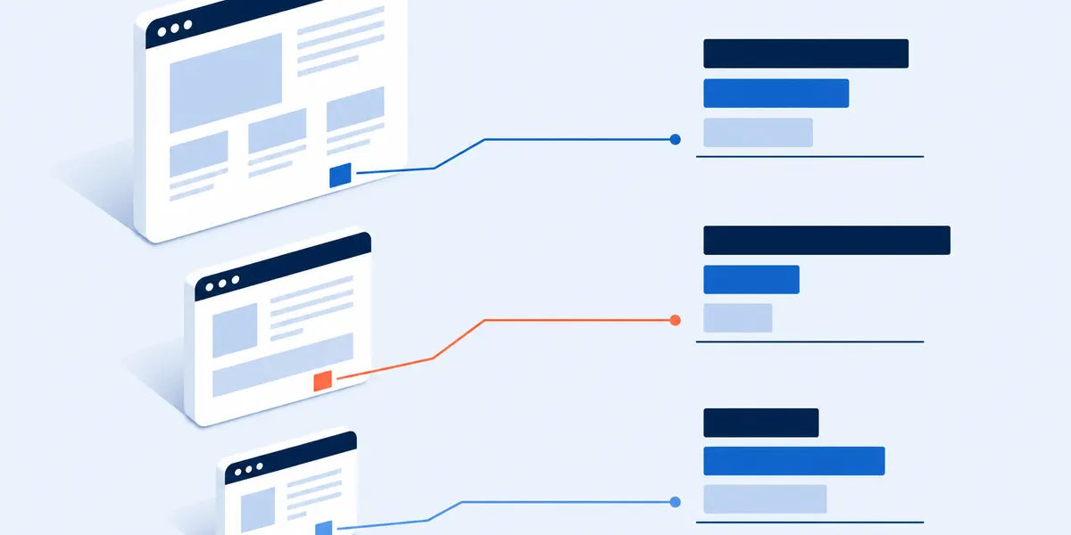
Three browser windows each carrying a small link marker, with separate lines running from each marker to its own separate set of result bars
One survey, three placements, three separate sets of answers. That is how a link tells you where a complaint came from.

If the thing you want feedback on is not a public website, two closer templates exist. For a mobile app rather than a site people open in a browser, the app user feedback survey asks what only an app can be asked. For an internal tool your team signs into all day, the dashboard survey questions keep that framing. This one assumes a visitor who may never come back.

Four moments to send a website feedback survey

Timing is the only lever a link gives you. Each of these four moments reaches a different visitor and misses a different one, so pick the row that matches the decision you have to make.

The momentWhere the link goesWhat it reachesWhat it misses
Somebody finishes somethingThe confirmation screen: order placed, account created, file downloaded, ticket closed.The whole trip, from somebody who got what they came for and is at a natural pause.Everybody who did not finish, which is the group you most want to hear from.
A visitor wants to speak, unpromptedA feedback link in the footer of every page, live all the time.The person who is stuck right now, in their own words, while they are still stuck.A fair sample. Everybody in it chose to click, so it is a list of problems, not a measure.
A few days after the visitAn email to customers, subscribers or members you can already reach.Considered answers, and the same link can go out again months later for a comparison.Anybody you have no address for, which on most sites is nearly everybody.
Around a redesignThe same link, before you change anything and again a month after.A before and after on identical wording, the only comparison here you can defend.The cause. It shows you the direction and leaves you to work out what moved it.

The two placements to start with are both ends of something. The UK government service manual, writing for teams running this at national scale, puts both in writing: let users tell you what they think once they have finished using the service, and also let them give feedback from any page, through a page linked in the footer of every one.[1]

Keep the link out of the middle of a task. A survey offered halfway through a checkout or a long form competes with the thing the visitor came to do. Put it after the task ends, or leave it in the footer where it waits to be chosen.

The fourth row only works on identical wording. Copy the survey, change the date you send it, and change nothing else.

The 14 website feedback survey questions

Every question, the scale it uses, and what an answer is telling you. Copy one block, copy all fourteen, or open the survey and edit it.

Plain text, one question per line, with the answer scale.

The visit, in three taps

Intent, outcome and blocker, asked before anything is rated, because a rating from somebody who came to buy and one from somebody who came for support are not the same rating. All three are taps, so the survey opens at its cheapest question.

  1. What did you come to this site to do today?Choose oneThe split you apply to everything else. Edit the option list to the four or five reasons people actually arrive at your site.
  2. Did you get it done?Choose oneThe one answer worth reporting on its own. Everyone who chose No or Partly is your fix list.
  3. If something got in the way, what was it?Choose oneThe blocker, from a fixed list so it counts rather than reads. The last option lets somebody whose visit went fine answer it honestly, so nobody is stranded.

One open box, asked early

The single written answer, placed before the rating block rather than at the end. Answers to open-ended questions asked later in a web questionnaire are shorter than the same questions asked earlier.[3]

  1. In your own words, what would you change about this site?Open text, optionalThe only place a visitor can name something you did not think to ask about. Read these before you open a chart.

Finding your way

Three statements on one 5-point agree scale, covering what a visitor has to manage before any of your content matters: find it, follow it, understand it.

  1. The information I needed was easy to find.5-point agreeFindability. Set it beside question 2: disagreement here from people who did not finish names the fix.
  2. It was clear where to go next on each page I opened.5-point agreeNavigation, asked as a statement about the page rather than about the menu, because a visitor cannot tell you which part of the design failed them.
  3. The wording on this site made sense to me.5-point agreeLanguage. Compare it against question 13: a gap between first-time visitors and regulars points at in-house jargon.

Speed and trust

Two statements that decide whether a visitor stays long enough for anything else to matter. Neither is a measurement. Both are the visitor's own account of the trip, which is the kind of evidence a survey collects and the only kind it can.[2]

  1. The pages loaded fast enough for what I was doing.5-point agreeHow the site felt, not how fast it was. Your own timing tools have the milliseconds; this has whether it was fast enough for the job in hand.
  2. I felt I could trust this site.5-point agreeTrust, asked plainly and once. It is the question an abandoned checkout cannot answer for you.

What to fix

One check that something broke, and one forced choice from a fixed list, so the improvement answers arrive as counts you can rank rather than a pile of prose.

  1. Did anything on this site fail to work while you were here?Choose oneA yes is worth chasing the same day, carrying the device answer with it.
  2. Which one change would help you most on your next visit?Choose onePairs with question 4: the open box gives you the words, this gives you the counts. Rewrite the options to match things you could actually ship.

Context, and the close

Three cheap taps at the end. The last question is a rating rather than a text box or an email field, so the final thing asked is one tap.

  1. What are you using to look at this site right now?Choose oneThe most useful split in the results. Filter the ratings by it before you average anything.
  2. Is this your first visit to this site?Choose oneSeparates a first impression from a habit. The same complaint means a different thing from each.
  3. Overall, how was this visit?5-point ratingThe closing rating, and the only number this survey produces. Report it as the percent who chose good or very good, using the calculator above.

All fourteen are already built, so you can start a free survey from this set in a couple of minutes and rewrite any wording that does not sound like your site.

No score, and no items from a published usability scale. Nothing here is marked out of 100, because this survey is built to produce a list of things to change rather than a number to compare. If a comparable number is what you were sent to get, the next section says where it lives.

Turning the answers into a ranked fix list

The output is a short list of things to change, in an order you can defend, plus one number you can put on a slide.

Start with the people who did not finish. Filter to everybody who answered No or Partly on question 2, then read their blocker, their open box and their improvement pick together. That subset is the fix list. The rest of the answers tell you what not to break while you fix it.

Count the picks, quote the words. Question 11 gives you a ranked list, because everybody chose from the same options. Question 4 gives you the sentences that explain a rank. A count with one quotation beside it is the whole report.

The one number, and what it is not. Question 14 is reported as the percent of visitors who rated the visit good or very good. That is your own trend line against your own last send, not a position in a league table, because nothing here is measured on a published scale.

If a number really is the point, two other pages own one. For a comparable advocacy figure with the arithmetic worked through, use the NPS score calculator. For a standardised score for one interface, from people who have just used it, the usability survey questions are built for that and this survey deliberately is not.

Scattered squares passing through a funnel and arriving as a stack of five ranked bars of decreasing length
Scattered answers in, one short ranked list out. The ranking is what makes it actionable.

Who a link never reaches

The gap this survey cannot close, stated plainly, and what to do about it.

A link has to be clicked. So every answer comes from somebody still on your site and still willing to give you three minutes. A visitor who arrived, could not see what they came for, and closed the tab in five seconds is not in your results and cannot be. Your analytics can see that visit; this survey cannot.

It collects what a visitor says, not what they did. A survey is a visitor's own account of their trip, which is a different kind of evidence from a recording of it, and questions beginning with why are better answered by talking to a few people than by counting answers from many.[2]

The two copies do two different jobs. Everybody who finished is offered the confirmation-screen version, so that is the one to read as a percent. The footer version is a queue of problems to check somewhere else, never an average.

Website feedback survey FAQ

What questions should a website feedback survey ask?

Six things: what the visitor came to do, whether they managed it, what got in the way, how the site felt to find and read, what they would change, and the two facts that change how you read the rest, their device and whether they had been before. There is no formal standard for the list, and the published guidance worth following is to always include an open question about how to improve.[1]

Is this an on-site intercept or an exit-intent popup?

No. It is a survey at its own link, which you can also embed inside one of your own pages. It does not open by itself, it does not choose a moment, and it does not react to a cursor leaving the window. Widgets that do those things are a separate product category and this is not a substitute for one. It is the thing you can put live this afternoon without touching your site code.

How many answers do I need before this means anything?

Read the written answers from the first one. Hold the percentages back until the top pick on question 11 is clearly ahead of the second, because with a handful of answers one person changes the order. A ranking you would not defend to the person whose work it criticises is not ready to show.

Should I add an email field so I can reply?

This template does not have one, because it is asked at the point somebody has decided to be honest. If you need a way back to people, add one optional line at the very end, after everything you actually need. The cheaper version is to put your contact address on the closing screen.

Can I use it around a website redesign?

Yes, and the fourth row of the table above is how: send the identical fourteen questions in the weeks before you change anything, then again a month after launch. What it will not do is design the new site for you, and a survey run only after a launch has nothing to compare itself with.

Methods and sources

What this template is based on

The two placements the page recommends starting with, the end of a task and a feedback page linked from the footer of every page, follow published UK government service guidance,[1] the single open box sits before the rating block rather than after it on experimental evidence about question position in web questionnaires,[3] and the limits section follows the standard attitudinal-versus-behavioural distinction.[2]

Question licensing

Nothing here reproduces a licensed, paid or standardised instrument. No item comes from a published usability scale, and no advocacy or satisfaction score is computed. Every question was written for this page and is free to copy, edit and send anywhere.

Limits and disclosure

No response-rate or completion benchmark is offered for this survey. The figures circulating for website feedback surveys are vendor self-reports published without a method or a sample size, so none of them is quoted here. Nothing on this page is legal or accessibility advice.

SuperSurvey makes the editor this template opens in. Everything here works with or without it.

References

  1. GOV.UK. Measuring user satisfaction. Service Manual, updated 19 February 2021. Crown copyright, Open Government Licence v3.0. gov.uk
  2. Brown, M. Should You Run a Survey? Nielsen Norman Group, 23 February 2024. nngroup.com
  3. Galesic, M. and Bosnjak, M. Effects of Questionnaire Length on Participation and Indicators of Response Quality in a Web Survey. Public Opinion Quarterly 73(2), 2009, pages 349 to 360. academic.oup.com

Put the link where your visitors already are

Fourteen questions, about three minutes, no name asked. Open it in the editor, rewrite the options to match your site, and choose the moment.

Use this template